After using images and photos from the internet to create preliminary designs, I had a solid idea in my head of what photos I needed to take to create my final design. I needed an extreme close up shot of a face. The main facial features I needed in the photo were the eyes and the nose. I would then take these photos and edit them to create an interesting effect that displays the duality theme that I wanted to run through the music video as well as the CD cover and advert.
 |
| PHOTO 1 |
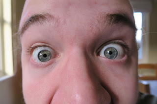
This image is an extreme close up of my face that focuses entirely on the eyes. I composed this shot so that my eyes fell on the vertical lines of third so as to naturally draw the audience towards them. By cutting the shot just below the nose, it has an uncomfortable feel; the audience desire to see the entire face but never can. I felt this was an effective photo as it was bold, dominant, engaging and original. As well as this the bright side lighting would lend itself to the filter I wanted to apply to the photo. I wanted to make the photo black and white, increase the intensity so that the blacks ere darker and the whites lighter and then apply the 'Cutout' filter on Photoshop so that the photo was simplified in to colour levels. As there lighting was bright and relatively intense, I knew that photoshop would be able to pick up the different colours and facial. shapes in the photo.
PROS: Focus on eyes, uncomfortable, engaging, interesting photo, original, good lighting
CONS: Not as intense lighting as some of the other photos
 |
| PHOTO 2 |
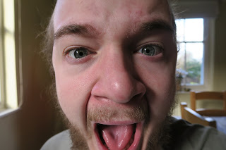
This is another photo from he same shoot as Photo 1. In this photo I was slightly further away from the camera resulting in a less extreme, less uncomfortable close up. I decided to change my facial expression in this photo to see what effect it had after the editing of the photo. As this photo is more dynamic and portrays more movement, there will be a greater amount of shadows and wrinkles. After editing this will result in more contrast as there will be more dark areas to contrast with the lighter areas. However this photo lacks some of the discomfort photo1 achieved. As the audience can see more of the face, the photo feels more resolved. In addition to this because the shot isn't as extreme of a close up, the photo is more aesthetically comfortable. This photo again places emphasis on the eyes via the use of the compositional technique, rule of thirds. The lighting in this shot is more effective than the first. I think this because one side of my face is well lighted with few shadows where as the other half is cast in shadow. I think even before editing, this photo shows signs of duality. I think that photo 1 and photo 2 could work well in combination to further portray the theme of duality through the contrasting facial expressions.
PROS: Very good lighting, interesting facial expression, works well with the editing filter
CONS: Doesn't have the uncomfortable feel to it like the first photo, eyes aren't as dominant
 |
| PHOTO 3 |
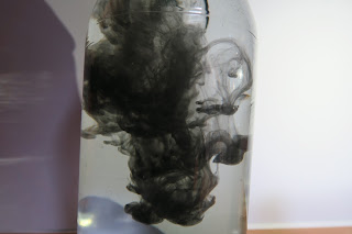
While I had not outlined the need for this shot in my preliminary ideas, I felt like i needed a 'filler' image that I could use if needed. For example for the middle two pages of the CD artwork, an image such as this could work effectively. I wouldn't be using this image as a main focal point for my artwork instead it'd be used as a back up or filler image. I wanted an image that maintained the theme of duality but wasn't too dominant or intrusive. This is the idea and shot that I created. It is a closeup of some black food colouring willing in water. I felt that this shot was un-intrusive and interesting but also reflected the duality of the main character in my music video as well as the intertwined and fluid relationship between the internal 'good' in someone and the internal 'bad'. The photo itself was successful in some ways but did have faults. I lacked the proper equipment to create a lighting rig powerful enough to produced a truly white background. As a result the photo looks under lighted and slightly amateur. This could be resolved in editing but still would not produce as good a quality shot as a properly lighted image. I felt that the actual swirling effect worked well and captured the themes of duality and fluidity that I wanted it to.
PROS: Highlights theme of duality, interesting effect, would work well as a filler shot
CONS: Bad lighting, looks like an amateur shot
 |
| PHOTO 4 |
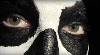
This final image is a screenshot from our music video. It is an extreme close up of the main characters face. I included this image as, unlike the photos from my face, this shot creates a direct and very obvious link to the music video and, furthermore, to the theme of duality. When edited using the same filter as the first two photos, the black and white would contrast excellently and would also allow the eyes to standout and be the focal point of the shot. The issue with this photo is that it is a difficult shape. Because it is a screenshot from a video, if I wanted the face to fit on to a square CD cover I would have to squash and slightly distort it. As well as this, while I like the fact that the image creates a clear link tot he music video, I feel like the link is perhaps to obvious and overpowering. It also reduces the creative power I have as all I have to work with is the single screenshot from the video. With the first two photos I can recreate or retake them to try and fix or improve them.
PROS: Portrays theme of duality well, links to music video very well, interesting close up for audiences
CONS: Difficult shape as a result of it being a screenshot, lower quality, style is simply copied from the music video.
Chosen Images: Photo 1 and Photo 2
I decided to use both Photo 1 and photo 2 as the images for my CD cover. I felt like between both of them they portrayed the theme of duality well, they were interesting and original, they would capture audiences attention and would work effectively with the editing filter I had planned. As well as this, using two photos would allow me to use different images on the front and back of the CD cover resulting in a more interesting and varied final piece.


No comments:
Post a Comment