Thursday, 23 March 2017
Friday, 17 March 2017
Tuesday, 14 March 2017
UPDATED: Q2 - How effective is the combination of your main product with ancillary texts?- BEN RODWELL
In order to create a coherent brand identity for 'Bad Sounds' (the band I had chosen), synergy needed to be apparent between my music video, my CD panels and my advert. I feel that all three of my products are clearly linked both visually and thematically as a result of specific design and layout choices.
The repetition of the font and logo throughout my print productions again creates a strong visual link between them. I used the logo on all the CD panels as well as on the advert to reinforce and establish the logo to the audience. I decided to use an edited and original font as the logo for my band as I thought that not only was it visually interesting but also it provided a clear and recognisable brand for the band. By using an inverted font, the logo also creates a thematic link to the music video's theme of duality; there are two sides to the font and only one of them is being shown. The combination of a distinctive font with the logo of the band also helps create the minimalist look of the front cover as there are
fewer items on the front cover. I feel that by creating a distinctive logo and then using that logo across all of the print productions, a very strong and coherent connection is made between them. All the pieces have been branded by the logo and are therefore clearly part of Bad Sound's release. The logo helps bind all of the pieces together and as well as this establishes the bands identity and brand.
In addition to this the use of the same font throughout all of the print productions again establishes a clear visual connection between them all. I used the font 'FFF' for all of the small font on the CD panels (such as the track listing and small print) and on the advert (for the quotes). I chose FFF as although it was a bold, sans serif font, it was also recognisable and original and so effectively created the link between the print productions., Had I used a common font such as Times New Roman, audiences would not necessarily assume that the pieces are connected because so many things use this font. However by using the same, original font across the productions audiences will understand that the productions are all linked. The font is effective at creating a link between the productions because of its originality and because of identifiable it is.
Finally, the visual links created by the colour scheme and the composition of the photos furthermore establish a thematic link between the print productions and the music video. The contrasting dark and light colour schemes used on the CD panels and the advert and the face paint in the music video establish the theme of duality between the two products. The direct contrast between the dark and the light link with the portrayal of internal conflict between the good and the bad personalities of one person; the dark representing the bad and the light representing the good. While the visual style creates a strong and obvious link between all productions, the thematic link is more subtle and will appeal to audiences who are looking for metaphorical messages in the productions. By referencing the narrative of the music video in the colour scheme of the print productions, a coherent and sophisticated link is created which I feel will appeal to my target audience. As Bad Sounds music is creative and original I feel audiences who like their music will also appreciate the complex and metaphorical thematic link between my productions.
Theorists
Levi Strauss' theory of binary opposition could be effectively applied to thematic link between my music video and print productions. Strauss stated that humans invent opposites as a way of understanding and categorising the world we live in. For example, Strauss would state that we understand the meaning of 'rich' because of our understanding of 'poor'. Other examples of binary opposites are hot/cold, men/women, black/white and good/evil.This last example is especially present in the thematic link between my productions. As well as the clear visual links, the theme of duality or inner conflict between your good and bad sides links my productions. Strauss would state that I am binary opposing someones 'good' side with their 'bad'. The audience will quickly understand this binary opposition and furthermore my productions as a whole as the opposition is a traditional one used in media; a huge majority of films use the opposition of good and bad and their conflict as a central narrative. This is because it is accessible to all audiences. By repeating this binary opposition in both my productions, I have strengthened the coherent link between them.
In addition to this, Barthes' media theories could be applied to my productions. Barthes stated that narratives are made up of codes such as enigma codes and action codes which help engage with the audience. Furthermore there are two types of texts: closed and open. Closed texts have a specific meaning where as open texts have multiple, ambiguous interpretations. The repetition of codes in both my productions as well as the open nature of my texts helps establish a strong link between them. For instance both of my texts use an enigma code to maintain audiences attention and engage with them. The use of close up, heavily edited photos in my print productions makes the audience question who or even what the photo is of and in y music video, the face paint of the main character mirrors this. By creating a sense of enigma in both productions, the audiences are drawn in and engaged as they try to resolve the questions they have. In addition to this both of my productions are open meaning they don't have a set interpretation. Instead they are more ambiguous allowing audiences to draw their own conclusions. By creating two texts that are both open to interpretation and use enigmatic codes, I have strengthened the link between them.
Conclusion
In conclusion visual links are created between my media texts through the repetition of the colour scheme, the similarity in the composition of the photos, through the repetition of the logo and through the use of the same font throughout. Furthermore these visual links also help establish a thematic link between my pieces; the dark and light colour scheme establish the theme of duality in my print productions which links to the metaphorical narrative
of my music video
 |
| My CD cover uses a bold colour scheme and portrayal of someones face to create metaphorical meanings as well as a link to the music video |
 |
| Screenshot from my music video |
There is a clear visual link between my print productions and my music video. The most obvious visual link between music video and print productions is the face paint used on the main character in my music video and the editing style applied to the photograph on the CD cover. The strong contrast between light and dark on the faces of the music video and print productions respectively create a readable and coherent link. While the placement of the two colours is not identical on both faces, the repetition of strong contrasting black and whites on both is enough to show an obvious stylistic link between the two. As well as this, the metaphorical significance of the portrayal of the faces having light and dark sides reinforces the theme of duality which runs through music video and print productions. The dark is representing the bad and the white is representing the good. By using both colours on one face it implies that everyone has both good and bad personalities within them. Additionally the repetition of this technique acts almost like a motif throughout the productions, giving the band a unique signifier or symbol. Building upon this the repetition of the dark grey colour scheme throughout my print productions further reinforces a coherent synergy between my productions. By using a dark grey background in my back and front CD panels as well as my advert, it is clear to audiences that they all belong to one release and band. The use of this dark grey background in combination with the white font further reinforces the thematic link between the products via the inferred reference to duality. I feel that by using a similar colour scheme throughout both my music idea and print productions, a clear and coherent link is created which audiences can instantly read and understand. In addition to this, by using this colour scheme to portray the faces of the main characters in both productions in a certain way, the main theme of duality of all of the productions are linked and effectively portrayed.
| The logo creates an interesting visual style, provides an effective symbol for the band's brand and links to the theme of duality |
fewer items on the front cover. I feel that by creating a distinctive logo and then using that logo across all of the print productions, a very strong and coherent connection is made between them. All the pieces have been branded by the logo and are therefore clearly part of Bad Sound's release. The logo helps bind all of the pieces together and as well as this establishes the bands identity and brand.
 |
| The small font used on my advert for the quote is repeated on my CD panels to create a coherent link |
Finally, the visual links created by the colour scheme and the composition of the photos furthermore establish a thematic link between the print productions and the music video. The contrasting dark and light colour schemes used on the CD panels and the advert and the face paint in the music video establish the theme of duality between the two products. The direct contrast between the dark and the light link with the portrayal of internal conflict between the good and the bad personalities of one person; the dark representing the bad and the light representing the good. While the visual style creates a strong and obvious link between all productions, the thematic link is more subtle and will appeal to audiences who are looking for metaphorical messages in the productions. By referencing the narrative of the music video in the colour scheme of the print productions, a coherent and sophisticated link is created which I feel will appeal to my target audience. As Bad Sounds music is creative and original I feel audiences who like their music will also appreciate the complex and metaphorical thematic link between my productions.
Theorists
Levi Strauss' theory of binary opposition could be effectively applied to thematic link between my music video and print productions. Strauss stated that humans invent opposites as a way of understanding and categorising the world we live in. For example, Strauss would state that we understand the meaning of 'rich' because of our understanding of 'poor'. Other examples of binary opposites are hot/cold, men/women, black/white and good/evil.This last example is especially present in the thematic link between my productions. As well as the clear visual links, the theme of duality or inner conflict between your good and bad sides links my productions. Strauss would state that I am binary opposing someones 'good' side with their 'bad'. The audience will quickly understand this binary opposition and furthermore my productions as a whole as the opposition is a traditional one used in media; a huge majority of films use the opposition of good and bad and their conflict as a central narrative. This is because it is accessible to all audiences. By repeating this binary opposition in both my productions, I have strengthened the coherent link between them.
In addition to this, Barthes' media theories could be applied to my productions. Barthes stated that narratives are made up of codes such as enigma codes and action codes which help engage with the audience. Furthermore there are two types of texts: closed and open. Closed texts have a specific meaning where as open texts have multiple, ambiguous interpretations. The repetition of codes in both my productions as well as the open nature of my texts helps establish a strong link between them. For instance both of my texts use an enigma code to maintain audiences attention and engage with them. The use of close up, heavily edited photos in my print productions makes the audience question who or even what the photo is of and in y music video, the face paint of the main character mirrors this. By creating a sense of enigma in both productions, the audiences are drawn in and engaged as they try to resolve the questions they have. In addition to this both of my productions are open meaning they don't have a set interpretation. Instead they are more ambiguous allowing audiences to draw their own conclusions. By creating two texts that are both open to interpretation and use enigmatic codes, I have strengthened the link between them.
Conclusion
In conclusion visual links are created between my media texts through the repetition of the colour scheme, the similarity in the composition of the photos, through the repetition of the logo and through the use of the same font throughout. Furthermore these visual links also help establish a thematic link between my pieces; the dark and light colour scheme establish the theme of duality in my print productions which links to the metaphorical narrative
of my music video
Friday, 10 March 2017
Tuesday, 7 March 2017
Sunday, 5 March 2017


Development of initial ideas to final productions- BEN RODWELL
After obtaining feedback from my teachers about my initial ideas, I decided to make some adjustments to them. I wanted the final products to be as strong and professional looking as possible and so taking on board 2nd and 3rd opinions, I felt was vital.
BACK PANEL
During feedback I was told that the back panel was simply missing some elements that are ever present in genuine CD panels. One of these features was a small amount of text outlining the copyright surrounding the CD cover. To address this I wrote a small paragraph outlining the rights and copyright laws to do with the CD and placed this at the bottom.
Another thing I had to change was the position of the track listing. One of my teachers suggested that I line up the right hand edge of the track listing with the edge of the bar-code simply to make the page aesthetically even.
Finally I removed a track from the track listing to make the lyric book I had created work more effectively. The lyric book contained lyrics for 9 songs instead of 10 so I simply removed one track.
ADVERT
Feedback from my teachers and peers highlighted two minor issues with my advert. These were: the Facebook and Tittwer logos were too large and alaso had different corner (one had sharp corner the othe3r had rounded corners. The other issue was that the middle quote looked too long and would look more effetcive if it were split over two lines such as with the last quote.
Therefore I reduced the size of the logos to be the same height as the date. This gave a more coherent style and imprioved the minalimist aestehtic of the final design. In addition to this I smoothed over the corner of the Facebook logo to make it identical to the Twitter one. This again made the advert more visually symetrical.
The alter the middle quote I simply split the text over tewo lines. This reduced the lenght of the quote and furthermore added to ther symetcial visual style of the advert as it was more similar in olneght to the otyher two quotes.
MIDDLE PANELS-LYRICS BOOK
In my initial ideas I had two middle panels which used the lyrics of the album to create the logo of the band. While I thought that this design worked effectively, feedback from my teachers and friends highlighted the simplicity of this technique. Furthermore a suggestion that was made to me was to create some kind of booklet that built upon the idea of combining the lyrics and the logo. Therefore I decided to include as well as the middle two panels of my CD, a lyrics booklet which used the lyrics of the album as a way of creating the logo.
I feel that not only will the lyrics be easier to read for audiences, but including a lyrics booklet makes my overall print productions more complex, interesting and original. While the lyrics of the song are not completely visible and are repeated multiple times in order to create the logo, I feel that audiences will still appreciate the combination of lyrics and logo in a booklet which is easier to read than the middle panels.
The use of booklet increases the complexity and originality of my design; many artists do not include this in their albums. Furthermore I feel this will appeal to my audience as the music of 'Bad Sounds' is quirky and original also.
BACK PANEL
 |
| Initial Idea |
During feedback I was told that the back panel was simply missing some elements that are ever present in genuine CD panels. One of these features was a small amount of text outlining the copyright surrounding the CD cover. To address this I wrote a small paragraph outlining the rights and copyright laws to do with the CD and placed this at the bottom.
Another thing I had to change was the position of the track listing. One of my teachers suggested that I line up the right hand edge of the track listing with the edge of the bar-code simply to make the page aesthetically even.
 |
| Final Product |
ADVERT
 |
| Initial design |
Therefore I reduced the size of the logos to be the same height as the date. This gave a more coherent style and imprioved the minalimist aestehtic of the final design. In addition to this I smoothed over the corner of the Facebook logo to make it identical to the Twitter one. This again made the advert more visually symetrical.
The alter the middle quote I simply split the text over tewo lines. This reduced the lenght of the quote and furthermore added to ther symetcial visual style of the advert as it was more similar in olneght to the otyher two quotes.
 |
| Final Design |
MIDDLE PANELS-LYRICS BOOK
 |
| Initial middle panel ideas |
 |
| 1st page from the lyric booklet |
In my initial ideas I had two middle panels which used the lyrics of the album to create the logo of the band. While I thought that this design worked effectively, feedback from my teachers and friends highlighted the simplicity of this technique. Furthermore a suggestion that was made to me was to create some kind of booklet that built upon the idea of combining the lyrics and the logo. Therefore I decided to include as well as the middle two panels of my CD, a lyrics booklet which used the lyrics of the album as a way of creating the logo.
I feel that not only will the lyrics be easier to read for audiences, but including a lyrics booklet makes my overall print productions more complex, interesting and original. While the lyrics of the song are not completely visible and are repeated multiple times in order to create the logo, I feel that audiences will still appreciate the combination of lyrics and logo in a booklet which is easier to read than the middle panels.
The use of booklet increases the complexity and originality of my design; many artists do not include this in their albums. Furthermore I feel this will appeal to my audience as the music of 'Bad Sounds' is quirky and original also.
 |
| 2nd page from the lyric booklet |
 |
| 3rd page from the lyric booklet |
Friday, 24 February 2017
Thursday, 9 February 2017


Sunday, 5 February 2017
Logo Ideas- BEN RODWELL
I decided to create a logo for my CD cover. As well as adding the visual style of the CD cover, a logo is an important marketing strategy for an artist. A logo gives them an identity and improves their image as a standout and identifiable brand. it allows fans to quickly and easily show their membership to a specific fandom by showing this specific sign or symbol. A logo therefore has to be relatively simple, original and recognisable to one specific band or artist. I wanted a logo that represented the theme of duality portrayed in my music video. I also thought that a logo that created a reference the psychedelic elements of the band's music would work effectively and be popular with their fanbase. I created 3 ideas and then decided to evaluate them to decide on which is the strongest and therefore which one I should use for my CD cover
IDEA NO.1
Many reviewers of Bad Sound's song 'Avalanche' -for which we made a music video for- had commented on the clear 70s influence of the music. As vintage styles from decades such as the 70s and the 90s are popular at this point in time i wanted to try and incorporate some sense of this in to the band's logo. I knew that the combination of brown, yellows and oranges were typical of brands and artwork of the time and so decided to focus around this colour scheme. To combine this classic 70s aesthetic with something more mainstream and modern I looked to the trend of western companies using Chinese or Japanese symbols for logos. Companies such as 'Superdry' do this very successfully and I wanted to experiment with using asian writing to give the logo a very up to date look. The final idea used the simplified Chinese symbols for 'Bad Sounds' encapsulated by a circle. Everything in the logo was brown with orange and yellow shadows, giving it the 70s aesthetic I wanted. This logo does not represent the theme of duality which is something I wanted it to do. It does however have links to the psychedelic art movement via the references to 70s culture. The logo is relatively simple and original and so would give the band a clear and recognisable image.
PROS: Bold, original, has links to 70s/psychedelia, modern style via use of Chinese writing, even shape resembling a physical stamp
CONS: No link to theme of duality, could be too complex to easily replicate
IDEA NO.2
I made this logo by editing the font 'Bebas Neue'. Firstly I made the font italic and then secondly I inverted it: making the bodies of the letters invisible and the spaces created by the letters highlighted. Instead of being an image or graphic, this logo would instead be the way in which the band's name is printed on the CD cover. Many famous bands and artists use a specific font as their motif and furthermore as their standout logo. For example Eminem, The Beatles, Led Zeppelin and The Sex Pistols. I liked this idea as it meant my CD cover could have less on it allowing any artwork to standout more. Instead of having the band name, the logo, the album name and the artwork there could simply be the band name and the artwork. This logo is highly original and also engages with the audiences; they have to spend time working out what the text says. This logo also provides a sense of exclusiveness to the fanbase- they will know what it says but other people who aren't familiar with the band won't, making Bad Sound's target audience feel more involved with the band. This logo links to the theme of duality very efectviely. It portrays two sides to the font which links well to the portrayal in the music video of humans as having two distinct sides. The font is reversed creating a contrast to normality which again links well to the music video and the music itself's psychedelic influences. The only negative of this font is that some popes may find it too difficult to read however it could be argued that this intensifies the logos effectiveness as only fans of the band will know what it reads.
PROS: Original, strong links to duality, links to the reversal of normalcy (psychedelia), strong identity for the band, combines logo and band name resulting in a less cluttered CD cover.
CONS: Some may find it too difficult to read
IDEA NO.3
While my 2nd idea created links to duality, I wanted to see how clearly I could portray the intertwining relationship of the 'good' and the 'bad' which I had represented in the music video. In my third design I used the letters 'B' and 'S' from 'Bad Sounds' to portray this relationship. The letters are intertwined with the S curling in and out of the B. This represents how the good and bad in one person are not necessarily completely separate (a message also portrayed in the music video). In addition to this the use of black and white in the colours strengthens the portrayal of good and bad as they are two highly contrasting colours. This design is simplistic and could be easily replicated by fans. The box around it gives it and even, stamp like aesthetic as if all of the band's CDs had physically been branded. However this design may be too heavily reliant n the the theme of duality. For instance Im not sure how well it work on other CD covers that didn't need to have a link to duality. In addition to this I feel the design is the weakest in terms of how professional it looks. While I like the concept of this idea I feel this design lacks the professional image of the other two ideas. This design also doesn't give as strong an identity to the band as the other two designs. After evolution I think this is m weakest design.
PROS: Conveys duality very strongly, fairly simplistic and bold, easily replicable, references physical branding which is attractive in logos
CONS: Not as professional looking as the other two designs, may not work in other instances/too reliant on the theme of duality, doesn't portray as strong an identity to the band.
Chosen Logo: IDEA NO.2
I felt this idea was the strongest. It was original and therefore provided the band with a recognisable identity and image. It linked to the theme of duality strongly but wasn't bound to it so it could be used on other albums or adverts. It was exclusive to fans; they would know what it read but outsiders wouldn't making theme feel a connection with the band. It combined the name of the band with the logo meaning the cover of the cd would be less cluttered allowing for a more minimalist style. Although it isn't necessarily the easiest to read this isn't an issue as audiences will spend tie trying to figure out what it says and therefore will be spending more time looking at the CD cover itself.
| IDEA NO. 1 |
IDEA NO.1
Many reviewers of Bad Sound's song 'Avalanche' -for which we made a music video for- had commented on the clear 70s influence of the music. As vintage styles from decades such as the 70s and the 90s are popular at this point in time i wanted to try and incorporate some sense of this in to the band's logo. I knew that the combination of brown, yellows and oranges were typical of brands and artwork of the time and so decided to focus around this colour scheme. To combine this classic 70s aesthetic with something more mainstream and modern I looked to the trend of western companies using Chinese or Japanese symbols for logos. Companies such as 'Superdry' do this very successfully and I wanted to experiment with using asian writing to give the logo a very up to date look. The final idea used the simplified Chinese symbols for 'Bad Sounds' encapsulated by a circle. Everything in the logo was brown with orange and yellow shadows, giving it the 70s aesthetic I wanted. This logo does not represent the theme of duality which is something I wanted it to do. It does however have links to the psychedelic art movement via the references to 70s culture. The logo is relatively simple and original and so would give the band a clear and recognisable image.
PROS: Bold, original, has links to 70s/psychedelia, modern style via use of Chinese writing, even shape resembling a physical stamp
CONS: No link to theme of duality, could be too complex to easily replicate
| IDEA NO. 2 |
IDEA NO.2
I made this logo by editing the font 'Bebas Neue'. Firstly I made the font italic and then secondly I inverted it: making the bodies of the letters invisible and the spaces created by the letters highlighted. Instead of being an image or graphic, this logo would instead be the way in which the band's name is printed on the CD cover. Many famous bands and artists use a specific font as their motif and furthermore as their standout logo. For example Eminem, The Beatles, Led Zeppelin and The Sex Pistols. I liked this idea as it meant my CD cover could have less on it allowing any artwork to standout more. Instead of having the band name, the logo, the album name and the artwork there could simply be the band name and the artwork. This logo is highly original and also engages with the audiences; they have to spend time working out what the text says. This logo also provides a sense of exclusiveness to the fanbase- they will know what it says but other people who aren't familiar with the band won't, making Bad Sound's target audience feel more involved with the band. This logo links to the theme of duality very efectviely. It portrays two sides to the font which links well to the portrayal in the music video of humans as having two distinct sides. The font is reversed creating a contrast to normality which again links well to the music video and the music itself's psychedelic influences. The only negative of this font is that some popes may find it too difficult to read however it could be argued that this intensifies the logos effectiveness as only fans of the band will know what it reads.
PROS: Original, strong links to duality, links to the reversal of normalcy (psychedelia), strong identity for the band, combines logo and band name resulting in a less cluttered CD cover.
CONS: Some may find it too difficult to read
 |
| IDEA NO. 3 |
IDEA NO.3
While my 2nd idea created links to duality, I wanted to see how clearly I could portray the intertwining relationship of the 'good' and the 'bad' which I had represented in the music video. In my third design I used the letters 'B' and 'S' from 'Bad Sounds' to portray this relationship. The letters are intertwined with the S curling in and out of the B. This represents how the good and bad in one person are not necessarily completely separate (a message also portrayed in the music video). In addition to this the use of black and white in the colours strengthens the portrayal of good and bad as they are two highly contrasting colours. This design is simplistic and could be easily replicated by fans. The box around it gives it and even, stamp like aesthetic as if all of the band's CDs had physically been branded. However this design may be too heavily reliant n the the theme of duality. For instance Im not sure how well it work on other CD covers that didn't need to have a link to duality. In addition to this I feel the design is the weakest in terms of how professional it looks. While I like the concept of this idea I feel this design lacks the professional image of the other two ideas. This design also doesn't give as strong an identity to the band as the other two designs. After evolution I think this is m weakest design.
PROS: Conveys duality very strongly, fairly simplistic and bold, easily replicable, references physical branding which is attractive in logos
CONS: Not as professional looking as the other two designs, may not work in other instances/too reliant on the theme of duality, doesn't portray as strong an identity to the band.
Chosen Logo: IDEA NO.2
I felt this idea was the strongest. It was original and therefore provided the band with a recognisable identity and image. It linked to the theme of duality strongly but wasn't bound to it so it could be used on other albums or adverts. It was exclusive to fans; they would know what it read but outsiders wouldn't making theme feel a connection with the band. It combined the name of the band with the logo meaning the cover of the cd would be less cluttered allowing for a more minimalist style. Although it isn't necessarily the easiest to read this isn't an issue as audiences will spend tie trying to figure out what it says and therefore will be spending more time looking at the CD cover itself.
Potential Images- BEN RODWELL
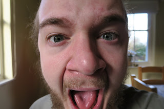
After using images and photos from the internet to create preliminary designs, I had a solid idea in my head of what photos I needed to take to create my final design. I needed an extreme close up shot of a face. The main facial features I needed in the photo were the eyes and the nose. I would then take these photos and edit them to create an interesting effect that displays the duality theme that I wanted to run through the music video as well as the CD cover and advert.
This image is an extreme close up of my face that focuses entirely on the eyes. I composed this shot so that my eyes fell on the vertical lines of third so as to naturally draw the audience towards them. By cutting the shot just below the nose, it has an uncomfortable feel; the audience desire to see the entire face but never can. I felt this was an effective photo as it was bold, dominant, engaging and original. As well as this the bright side lighting would lend itself to the filter I wanted to apply to the photo. I wanted to make the photo black and white, increase the intensity so that the blacks ere darker and the whites lighter and then apply the 'Cutout' filter on Photoshop so that the photo was simplified in to colour levels. As there lighting was bright and relatively intense, I knew that photoshop would be able to pick up the different colours and facial. shapes in the photo.
PROS: Focus on eyes, uncomfortable, engaging, interesting photo, original, good lighting
CONS: Not as intense lighting as some of the other photos
This is another photo from he same shoot as Photo 1. In this photo I was slightly further away from the camera resulting in a less extreme, less uncomfortable close up. I decided to change my facial expression in this photo to see what effect it had after the editing of the photo. As this photo is more dynamic and portrays more movement, there will be a greater amount of shadows and wrinkles. After editing this will result in more contrast as there will be more dark areas to contrast with the lighter areas. However this photo lacks some of the discomfort photo1 achieved. As the audience can see more of the face, the photo feels more resolved. In addition to this because the shot isn't as extreme of a close up, the photo is more aesthetically comfortable. This photo again places emphasis on the eyes via the use of the compositional technique, rule of thirds. The lighting in this shot is more effective than the first. I think this because one side of my face is well lighted with few shadows where as the other half is cast in shadow. I think even before editing, this photo shows signs of duality. I think that photo 1 and photo 2 could work well in combination to further portray the theme of duality through the contrasting facial expressions.
PROS: Very good lighting, interesting facial expression, works well with the editing filter
CONS: Doesn't have the uncomfortable feel to it like the first photo, eyes aren't as dominant
While I had not outlined the need for this shot in my preliminary ideas, I felt like i needed a 'filler' image that I could use if needed. For example for the middle two pages of the CD artwork, an image such as this could work effectively. I wouldn't be using this image as a main focal point for my artwork instead it'd be used as a back up or filler image. I wanted an image that maintained the theme of duality but wasn't too dominant or intrusive. This is the idea and shot that I created. It is a closeup of some black food colouring willing in water. I felt that this shot was un-intrusive and interesting but also reflected the duality of the main character in my music video as well as the intertwined and fluid relationship between the internal 'good' in someone and the internal 'bad'. The photo itself was successful in some ways but did have faults. I lacked the proper equipment to create a lighting rig powerful enough to produced a truly white background. As a result the photo looks under lighted and slightly amateur. This could be resolved in editing but still would not produce as good a quality shot as a properly lighted image. I felt that the actual swirling effect worked well and captured the themes of duality and fluidity that I wanted it to.
PROS: Highlights theme of duality, interesting effect, would work well as a filler shot
CONS: Bad lighting, looks like an amateur shot
This final image is a screenshot from our music video. It is an extreme close up of the main characters face. I included this image as, unlike the photos from my face, this shot creates a direct and very obvious link to the music video and, furthermore, to the theme of duality. When edited using the same filter as the first two photos, the black and white would contrast excellently and would also allow the eyes to standout and be the focal point of the shot. The issue with this photo is that it is a difficult shape. Because it is a screenshot from a video, if I wanted the face to fit on to a square CD cover I would have to squash and slightly distort it. As well as this, while I like the fact that the image creates a clear link tot he music video, I feel like the link is perhaps to obvious and overpowering. It also reduces the creative power I have as all I have to work with is the single screenshot from the video. With the first two photos I can recreate or retake them to try and fix or improve them.
PROS: Portrays theme of duality well, links to music video very well, interesting close up for audiences
CONS: Difficult shape as a result of it being a screenshot, lower quality, style is simply copied from the music video.
Chosen Images: Photo 1 and Photo 2
I decided to use both Photo 1 and photo 2 as the images for my CD cover. I felt like between both of them they portrayed the theme of duality well, they were interesting and original, they would capture audiences attention and would work effectively with the editing filter I had planned. As well as this, using two photos would allow me to use different images on the front and back of the CD cover resulting in a more interesting and varied final piece.
 |
| PHOTO 1 |
PROS: Focus on eyes, uncomfortable, engaging, interesting photo, original, good lighting
CONS: Not as intense lighting as some of the other photos
 |
| PHOTO 2 |
PROS: Very good lighting, interesting facial expression, works well with the editing filter
CONS: Doesn't have the uncomfortable feel to it like the first photo, eyes aren't as dominant
 |
| PHOTO 3 |
While I had not outlined the need for this shot in my preliminary ideas, I felt like i needed a 'filler' image that I could use if needed. For example for the middle two pages of the CD artwork, an image such as this could work effectively. I wouldn't be using this image as a main focal point for my artwork instead it'd be used as a back up or filler image. I wanted an image that maintained the theme of duality but wasn't too dominant or intrusive. This is the idea and shot that I created. It is a closeup of some black food colouring willing in water. I felt that this shot was un-intrusive and interesting but also reflected the duality of the main character in my music video as well as the intertwined and fluid relationship between the internal 'good' in someone and the internal 'bad'. The photo itself was successful in some ways but did have faults. I lacked the proper equipment to create a lighting rig powerful enough to produced a truly white background. As a result the photo looks under lighted and slightly amateur. This could be resolved in editing but still would not produce as good a quality shot as a properly lighted image. I felt that the actual swirling effect worked well and captured the themes of duality and fluidity that I wanted it to.
PROS: Highlights theme of duality, interesting effect, would work well as a filler shot
CONS: Bad lighting, looks like an amateur shot
 |
| PHOTO 4 |
PROS: Portrays theme of duality well, links to music video very well, interesting close up for audiences
CONS: Difficult shape as a result of it being a screenshot, lower quality, style is simply copied from the music video.
Chosen Images: Photo 1 and Photo 2
I decided to use both Photo 1 and photo 2 as the images for my CD cover. I felt like between both of them they portrayed the theme of duality well, they were interesting and original, they would capture audiences attention and would work effectively with the editing filter I had planned. As well as this, using two photos would allow me to use different images on the front and back of the CD cover resulting in a more interesting and varied final piece.
Thursday, 2 February 2017
Preliminary Ideas- BEN RODWELL
 |
| Idea 1 |
 |
| Idea 2 |
Pros: Eye Catching, links to duality and modern looking.
Cons: Title is not clear, pink colour does not reflect style of the music video
 |
| Idea 2 |
 |
| Idea 2 |
Pros: Original, creates logo for the band, engaging, links to duality, strong minimalist style
Cons: Font could be difficult to read, background
needs to be relatively simple
 |
| Add caption |
 |
| Idea 3 |

Instead of integrating the psychedelic reference via the text I decided to try and merge it with the facial image. I experimented by replacing either the black or white in the face with the psychedelic colours.Out of the two I felt that keeping the black and replacing the white worked the most effectively.This design portrayed the duality theme well; the black presenting the dull/bad side of a personality and the colour representing the creative/good side. Unlike the other design where the white was kept, this design was clearer and showed the image of a face more effectively to the audience. The issue with this design was that it did not lend itself to having text on. Because of the layout and intensity of the photo I could not find a way of placing font on which did not take away from the overall style. While I could create a super minimalist album with no writing on at all, I felt like my cover needed at least the band name. Another weakness of this design is that it would be difficult for me to recreate the colour swirls I had found on the internet.
Pros: Links to duality, effective and engaging style, right balance of ambiguity and clarity
Cons: Psychedelic colours would be difficult to create, does not allow for aesthetically pleasing placement of text
 |
| Idea 4 |
IDEA 4. For my final Idea I wanted to experiment with just having a font as the cover of my CD. I used a bold sans serif font and then used the psychedelic colours as the fill for the font. I placed this on a plain white background to create a very minimalist design. While I thought this design was eye catching and visually very pleasing, it had no real link to the theme of duality. While the others had used colours and photos to create the portrayal of the theme of duality and thus linking it to the music video, this idea only created links to psychedelia. In addition to this I decided it would be difficult to create 3 other panels and an advert in this design style. Furthermore because it was so simplistic I felt it did not reflect my ability on Photoshop.
Pros: Very strong, minimalist style, simple to create, represents psychedelic influence.
Cons: Overly simplistic, doesn't link to duality, doesn't reflect my Photoshop abilities.
Chosen Idea: Idea 2
I chose this idea as I felt the use of font was interesting and original and gave the CD cover and band as a whole an identity and logo. Additionally it linked effectively to the theme of duality and gave me room for development and creative change. The style is eye catching, engaging and modern and so reflects the musical style of the band.
Monday, 30 January 2017
Friday, 27 January 2017
Monday, 23 January 2017
Friday, 20 January 2017
Friday, 13 January 2017
UPDATED: CASE STUDY: How Does Paul Simon Engage With His Audience Through The Cover For 'Graceland'- BEN RODWELL


As well as taking stylistic influence from traditional, African religious artwork as highlighted through the Ethiopian artwork in the centre of the cover, the album has aspects of minimalism in addition. The album features a high amount of negative spacing. The cream coloured negative surrounds the central artwork as well as the simple, classic writing. The front cover of the album in-fact features only three things; the title of the album, the African artwork and the cream coloured, negative space. The use of the negative space focuses the audiences eye on the two main aspects of the cover, the title and the art. A very well known example of a minimilist album is Pink Floyd's 'Dark Side of The Moon'. The

 The font used on the front cover of 'Graceland' is ITC Novarese. The front was released in 1980 and has a sleek yet classic and traditional look as a result of its small, semi-integrated serifs. Again the use of this font promotes the minimalist style of the album as a whole. As well as being sleek and classic looking, the font is also relatively thin. It stands out but also does not draw attention away from the focus of the cover; the African art. The colour of the font contrasts with the negative space on the cover. The use of a blank font on a white, creamy background stands out as the colours are opposites of each other. The placement and arrangement of the font is in keeping with the minimalist, central construction of the album artwork. The font is aligned centrally and is placed in the centre of the upper section of the cover. The font is directly above the central artwork maintaining a clean, clear style. It pulls the audience focus to the centre of the cover and furthermore on to the artwork in the middle. The amount of words used on the cover of 'Graceland' are kept to a minimum. The maintains the minimalist, simple aesthetic of the cover. The only words on the cover are "Paul . Simon" and "Graceland". This gives the audience the two most important pieces of information; the name of the artist they are listening to and the name of the piece of work created by that artist. The use of this, bare minimalist approach to writing on album covers is a staple and motif of Simon's
 album covers. For instance the style can be seen on the album cover for Paul Simon's 5th album "One-trick pony".This technique of including just his name and the name of his album cover gives Paul Simon an effective way of promoting his album in clear and concise way. His audience are likely to recognise this style and therefore engage with the album more effectively.
 The focus of the cover of 'Graceland' is the traditional, 16th century, Ethiopian depiction of saint George on his horse. The album features a copy of this traditional artwork which is physically on display in the Peabody Essex Museum. The copy of the artwork is placed dead centrally in the middle of the cover. The position of the artwork dominates the cover, demanding the focus and attention of the audience. The negative space surrounding the artwork highlights its importance and makes the colours and definition of the artwork more intense. The composition and placement of the artwork as well as the font creates a symmetrical and even aesthetic to the cover. By placing the artwork centrally, not only is the audiences eye drawn toward it but also the symmetrical style of the album is better enforced. The colours and the style of the African artwork connote the hybrid, world music genre of the album and so allow the audience to better understand interpret the album. The bold red and blues of the artwork contrast heavily with the surrounding, cream coloured, negative space. This enhances the colours of the artwork, making them stand out and so further drawing the audiences eye toward it. The African artwork used on the cover of 'Graceland' takes inspiration from South African groups such as 'Ladysmith Black Mambazo'. LBM are an all male, South African acapella group who sing in traditional South African styles such as Isicathamiya and Mbube. They featured on tracks on Graceland such as 'Diamonds on The Soles of Her Shoes'. The cover of their album 'Shaka Zulu' has clear stylistic and aesthetic links to 'Graceland'. The use of traditional African artwork draws instant connections to 'Graceland' and this is furthered through the use of blank space and simplistic, minimalist text. The combination of western minimalism and African traditionalism on the cover of 'Graceland' mirrors the hybrid nature of the music.
The covers of 'Graceland' help create a constructed image of Paul Simon. The purpose of the album covers of Graceland is to portray the artist and the album in a certain way, this being the constructed image. For instance the use of neutral colours in the negative space contrasts heavily with the divide colour in the centre image pulling the focus on to that image. The image is of traditional African artwork therefore highlighting the World music genre of the album as well the cultural expertise of Paul Simon to bridge western and African Culture. The back cover of the album has picture of Paul Simon alone, wearing glasses and a jacket. Not only does the photo portray Simon as a sophisticated, intelligent artist which will show in his music, but it portrays Simon alone, without Art Garfunkel who he had been successful with before. The artwork is creating a constructed imagine of Paul Simon as cultural, intelligent and sophisticated but also alone, without the help of his long time collaborator Garfunkel. This image helps sell Simon as it creates a brand for him. He has parted from Simon and Garfunkel and has instead rebranded himself as a classier, more learned artists with different cultural influences. This image is constructed through the use of under stated colours, classic looking, classy font and an ultimately minimalist style for the cover art.
Paul Simon creates an aesthetically eye catching and visually imaginative piece of art in the cover of 'Graceland'. He combines design styles such a minimalism and African traditionalism to create a classic looking, engaging album cover. I believe that combining styles or adapting them is key to creating an engaging album cover. Using minimalism is an effective way of cratering an eye catching style as negative space pulls audiences eye towards the focal point of the cover. I could use this technique in my album cover to make sure the artwork is eye catching but also classic in its aesthetic and styling.
Subscribe to:
Posts (Atom)